InYourWeek.com Logo Redesign for Calendar Application
Want to win a job like this?
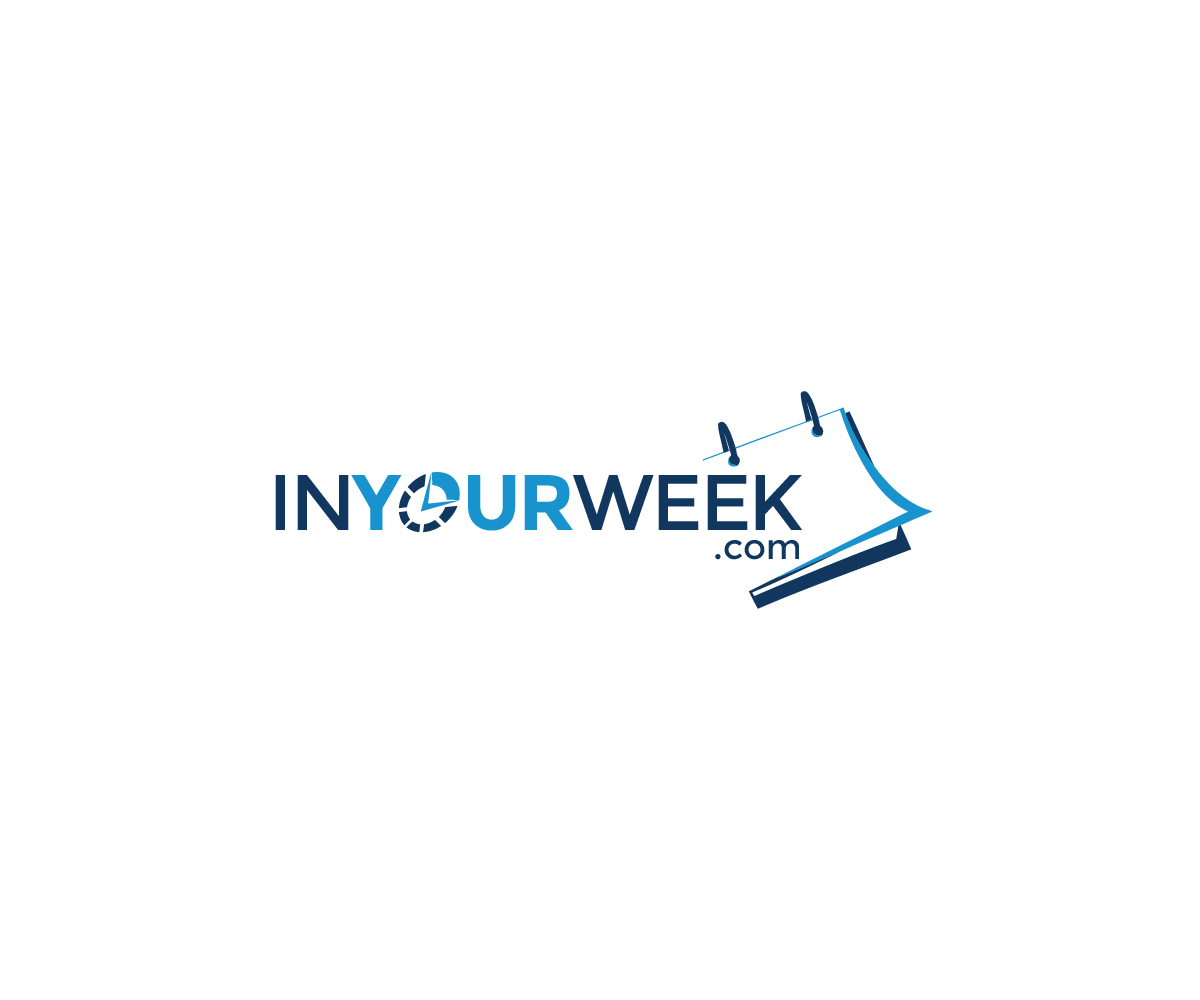
This customer received 66 logo designs from 15 designers. They chose this logo design from visioninsight as the winning design.
Join for free Find Design Jobs-
 US$160
-
 66 designs
-
 15 designers
Logo Design Brief
InYourWeek.com is a website advertising a calendar app that makes it easy to see your favorite sports teams, tv shows and movie/game release dates all on one calendar. Their logo and website looks like it was built in the late 90's and needs to be updated.
This is a logo redesign for the website. It should tie in with the application as much as possible. I'm envisioning a flat logo with with calendar symbol incorporated in it somehow. If the sports/movies/tv/games elements can be tied into the calendar in a clean minimalistic way - that could be a winner. But a simple logo that captures the essence of the product is really all we need. If possible emphasize 'your' in 'inyourweek.com' and place a low emphasis on the '.com' piece.
Here's a video that describes what the InYourWeek.com calendar app is all about: https://youtu.be/N_FSSWiXpMo
Target Market(s)
Millennials & Gen X Sports enthusiasts, TV watcher and gamers. Leaning on a more male demographic.
Industry/Entity Type
Entertainment
Logo Text
InYourWeek.com
Logo styles of interest
Pictorial/Combination Logo
A real-world object (optional text)
Character Logo
Logo with illustration or character
Font styles to use
Look and feel
Each slider illustrates characteristics of the customer's brand and the style your logo design should communicate.
Elegant
Bold
Playful
Serious
Traditional
Modern
Personable
Professional
Feminine
Masculine
Colorful
Conservative
Economical
Upmarket
Requirements
Must have
- Must be able to tie into the calendar application featured on InYourWeek.com
- Here's a video that describes what the InYourWeek.com calendar app is all about: https://youtu.be/N_FSSWiXpMo
Nice to have
- It would be nice if a flat designed minimalist calendar could tie into the logo and incorporate symbols for sports, gaming, tv & movies.
- From a UX perspective - the user would be able to intuitively see the logo and know what the product is - if not immediately - after reading a few tag lines.
Should not have
- Shouldn't have gradient colors like the old logo. Should not feature lots of colors unless the designer feels that would be a good way to draw contrast to the various calendar events capture in the InYourWeek.com application.