Non-Profit Foundation Needs An Updated Logo
Want to win a job like this?
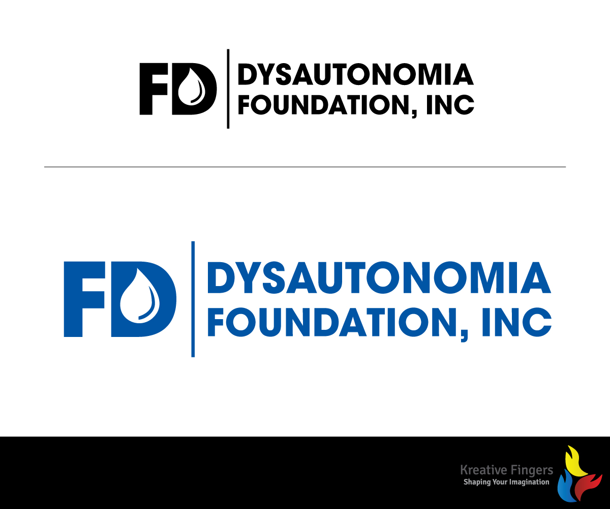
This customer received 66 logo designs from 25 designers. They chose this logo design from Kreative Fingers as the winning design.
Join for free Find Design Jobs-
 US$400
-
 66 designs
-
 25 designers
Logo Design Brief
We are updating the logo for our foundation, which logo was created in the 1950’s.
The Dysautonomia Foundation, Inc., is a is a 501c3 nonprofit organization that funds treatment and research for Familial Dysautonomia (“FD”) - a rare genetic neurological disorder that effects the sensory and autonomic nervous systems, causing life-threatening medical complications from birth. For additional information about FD and prior to commencing work it is important that you visit our website at http://www.familialdysautonomia.org/ to learn more.
We need a logo that keeps the blue and white color scheme of our existing logo but integrates an updated image of our Foundation. The existing logo uses a custom font for the “FD” and this font should not be used in your redesign. The logo should be presented in 3 treatments - as a standalone icon/symbol; a logotype/ wordmark; and a combination mark.
One of the symptoms of Familial Dysautonomia is the absence of tears, which is why there is a teardrop in the letter “D” of our existing logo. However, as a result of our advances in treatment of the disorder, the average lifespan of the FD population has dramatically increased from 5 years to 30 – 40 years old. Therefore, the image of children within the teardrop of the existing logo is dated and no longer representative of the mean age of our patients. As such, either that aspect of the logo needs to updated or eliminated. The design should reflect a hi-tech, modern feel, in keeping with the groundbreaking research and treatments that we are currently funding.
Target Market(s)
The core mission of the Dysautonomia Foundation is to raise money to fund the best possible medical care and scientific research for the benefit of people afflicted with FD. The Foundation also conducts social service and public awareness programs for the benefit of the FD community and for those in the general population who may be at risk for FD. As such, our primary constituents are:
• The families and friends of FD patients that provide donations;
• Government Agencies, Corporations, Foundations and other philanthropic; organizations that provide grants and charitable contributions;
• Members of the medical and scientific communities who work with FD.
Therefore, our new logo should appeal to and resonate with the above constituencies.
Industry/Entity Type
Non-Profit
Logo Text
Dysautonomia Foundation, Inc. (the name is case sensitive)
Logo styles of interest
Pictorial/Combination Logo
A real-world object (optional text)
Lettermark Logo
Acronym or letter based logo (text only)
Font styles to use
Colors
Colors selected by the customer to be used in the logo design:
Look and feel
Each slider illustrates characteristics of the customer's brand and the style your logo design should communicate.
Elegant
Bold
Playful
Serious
Traditional
Modern
Personable
Professional
Feminine
Masculine
Colorful
Conservative
Economical
Upmarket
Requirements
Must have
- You must retain the existing blue and white color scheme but can incorporate an offset color as well. The logo must incorporate a teardrop and if you choose to retain the images of people within the teardrop or elsewhere, they must be reflective of the current FD demographic. The logo should also have both a graphic and a text block. Monochrome, color and shadow versions required.
- The Color Must Be: Pantone Reflex Blue
Nice to have
- The logo could possibly have an element related to the autonomic or sensory nervous system(s), but that is not essential.
Should not have
- The logo should not have any other letters/words besides “FD” and “Dysautonomia Foundation, Inc.”
- Should not use existing font.