Nelson-based building company specialising in the construction of small residential houses.
Want to win a job like this?
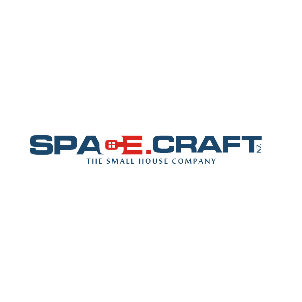
This customer received 51 logo designs from 18 designers. They chose this logo design from singularity D as the winning design.
Join for free Find Design Jobs-
 NZ$160
-
 51 designs
-
 18 designers
Logo Design Brief
The name of the company is space craft nz Ltd. It is important to us that the two words "space" and "craft" are separate and not confused into one word which implies outer space. We construct small, beautiful, architectually designed homes. The key is the clever use of the space we have and how we turn this (ie that's the craftsmanship bit!) into a smart, functioning house. "eco" ideals come as standard on our projects; we want to demarcate ourselves as building better designed homes and the emphasis is on small and quality. The final design should communicate our vision which is to build "more of what matters"
The images attached are ideas we like - though we do find the classic gable house a bit done to death! We'd like something bold without looking too "clip-arty" (like image one) .Like the idea of using woodgrain as part of the logo..but at this stage...we are open to anything. Thanks
Target Market(s)
People wanting 2-3 bed homes; downsizers, singles, couples. The housing market is vibrant, and these houses are bespoke. So, people who appreciate the value of good quality workmanship
Industry/Entity Type
Residential Construction
Logo Text
space.craft nz ltd
Logo styles of interest
Pictorial/Combination Logo
A real-world object (optional text)
Abstract Logo
Conceptual / symbolic (optional text)
Wordmark Logo
Word or name based logo (text only)
Lettermark Logo
Acronym or letter based logo (text only)
Look and feel
Each slider illustrates characteristics of the customer's brand and the style your logo design should communicate.
Elegant
Bold
Playful
Serious
Traditional
Modern
Personable
Professional
Feminine
Masculine
Colorful
Conservative
Economical
Upmarket
Requirements
Must have
- We want something clever. That reflects the clever use of the words in our business name.
Nice to have
- We like the idea of negative and positive space. I guess you know what I mean...FedEx and the invisible arrow being a good example, but we don't know what we don't know and that is why we are putting it out to professional designers.
Should not have
- Not to come across as an eco home - we don't want to target the "greenie" market or be seen to be hippy builders - we want to start an interest in the growth of small homes in the market place. Honestly, we also feel the angled gable house design (or pitched roof) is overdone by many other businesses.