Homepage design for Dutch Job Posting Site (E-Zend.nl)
Want to win a job like this?
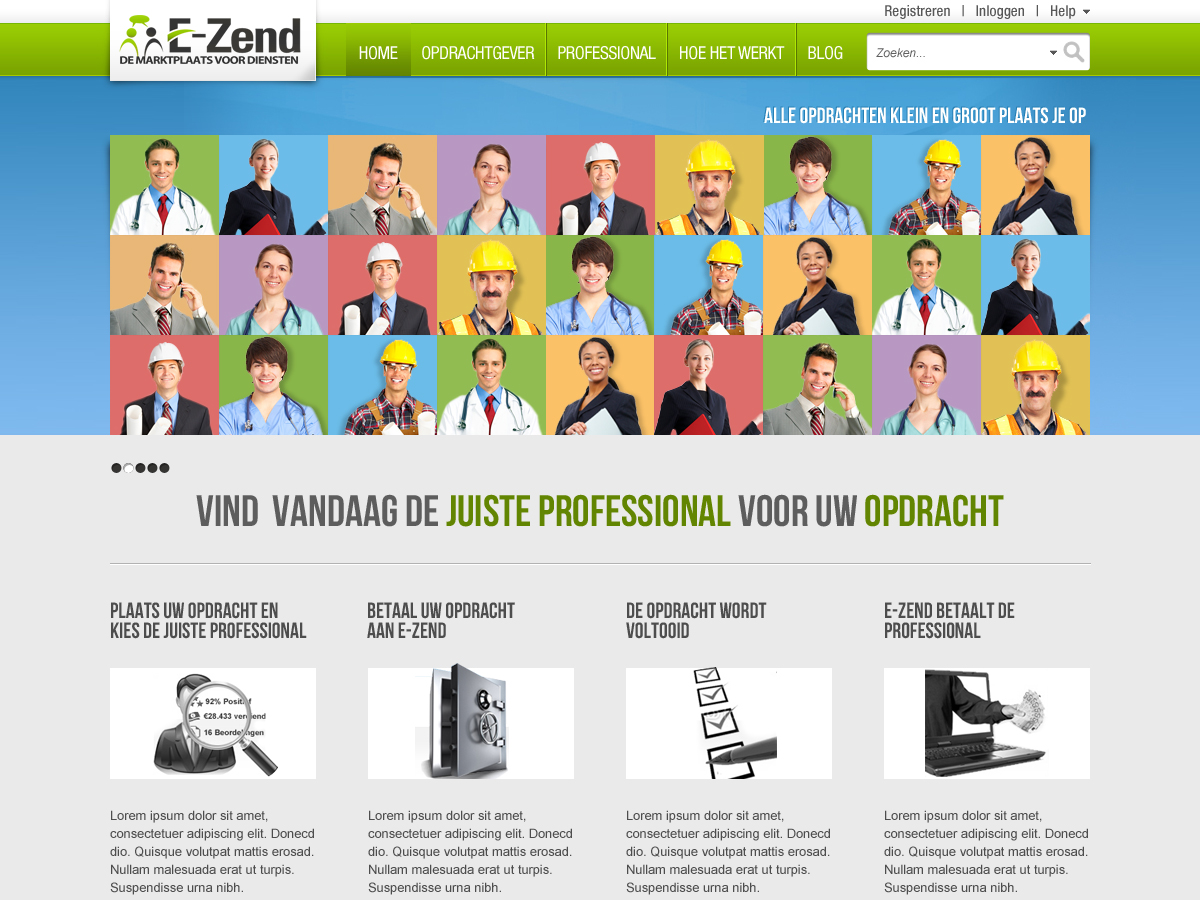
This customer received 23 web designs from 11 designers. They chose this web design from sakshiinfoway as the winning design.
Join for free Find Design Jobs- Guaranteed
-
 €525
€525
-
 23 designs
-
 11 designers
Web Design Brief
We need a redesign of our homepage www.E-Zend.nl to make it very clear what we do. We are an online job posting portal and are looking to recruit clients and professionals on a single page.
The Homepage will focus on CLIENTS (OPDRACHTGEVERS), with the idea that if we have a lot of jobs posted, then the professionals will come.
Important to know is that we now have ONE REGISTRATION for both professionals and clients - so there is no need for two separate registration options.
Also important to know is that the JOB POSTER pages will have a GREEN hyperlinks color (see the color above the OPDRACHTGEVER at the top of the screen) and the Professionals will have a BLUE hyperlinks color (see the color above the PROFESSIONAL at the top of the screen).
At the top of the page, we would like a 4 page slider (we will do the coding but just want 4 slides) that shows how it works and what makes us unique. In the examples below, you can see that we have already done 2 of them, and we will ask the designer to help do the other two once the project is awarded.
You can see from the images provided that we have already done most of the work. The HEADER WRAP and the FOOTER are already done, and you can use these in your examples.
Notice also in the image "Homepage-BannerBlank" the image used in the center. It is an image that is only as wide as the header and then fades off into a background image that we can use repeat-x in the css of the site which fills the screen on any monitor resolution. If you don't understand what I just wrote, you probably are not the right designer for the job.
Notice also that the two images "NU AANMELDEN" and "E-ZEND ESCROW" use background images that have a SUBTLE background image - it is not just a gradient color change. This is what we LOVE in the design so far.
You can see that our design is already very far advanced, so what we are looking for in a new design are not the overall redesign, but specific, subtle design improvements to give the page a CLEAN, FRESH, MODERN look without being busy and crowded.
Where we specifically want help is in these areas. The designers that show us these elements will be the ones selected. All others will be eliminated without further comment:
a) How to blend in the E-Zend logo into the header design without taking up more HEIGHT (we have done a white overlay, but this is where you can prove to us that you are great.
b) We need a font for our h1 tags in our site. This will be the same font used in "Laatste Opdrachten" "Laatste Blogs" "Zoek uw professional per categorie of rubriek". Do not use a webfont (Arial or Verdana). Instead, refer to the examples provided for inspiration of a font that best suits the site for a header.
c) We need better containers for "Laatse opdrachten", "Laatste Blogs" and Zoek uw professional per categorie of rubriek. They can have colors or just borders or just outlines. They should compliment the site look though and not distract from it.
d) Transitions between the containers and other elements. Right now they are all just boxy and separate, but there could be some overlap, some shadows, an image divider (as there is between "Laatste Blogs" and WildFM) but again, the transitions need top complement the design and not take it over.
Sites that appeal to us for what we are looking for are:
- apple.com
- www.rackspace.com*
- Crowdspring.com*
- Salesforce.com*
*What we like here are both the top PROMINENT central message and then the smaller subtler design transitions underneath.
Feel free to use images or icons to complement the look, but it must be clean, fresh and modern.
Updates
I just found another example of a webiste that has the carousel banner on the first page, Feel free to draw inspiration from this too:
http://www.vodafone.nl/zakelijk/
Added Monday, October 17, 2011
Project Deadline Extended
Reason: Very disappointing designs so far. Please look at the sites we gave as examples and inspiration. With the designs received so far, most are worse than what we have already
Added Wednesday, October 19, 2011
Looking at the multiple designs, we realize that for our whole site, we need to maintain ONE navigation menu at the top and the ideas posted thus far have not made us wnat to change that menu.
What we would ask then, is to MAINTAIN the top navigation menu and everything above it. RIGHT underneath the navigation menu, we'd like WHAT WE DO to stand out and be the most obvious part of the page. I have posted a design (homepage-top) that puts a big BLUE section in the middle that stands out.
We would like a lot more quiet, less colors, and more white on the page except in that section that we want to just JUMP out and be obvious.
As for the slider ideas, I have posted two pages from our powerpoint presentation that we want to make CLEAR on the homepage. Do NOT use the same images (I find them ugly) but use them to understand what we need to convey to the user.
Added Thursday, October 20, 2011
I will update the brief in 30 minutes. Please wait until then before submitting any new designs.
Added Monday, November 21, 2011
Please see the revised brief for the 4 specific items requested:
The task is not necessarily to build a new homepage from the ground up, but we specifically want help is in these areas. The designers that show us these elements will be the ones selected. All others will be eliminated without further comment:
a) How to blend in the E-Zend logo into the header design without taking up more HEIGHT (we have done a white overlay, but this is where you can prove to us that you are great.
b) We need a font for our <h1> tags in out site. This will be the same font used in "Laatste Opdrachten" "Laatste Blogs" "Zoek uw professional per categorie of rubriek". Do not use a webfont (Arial or Verdana). Instead, refer to the examples provided for inspiration of a font that best suits the site for a header.
c) We need better containers for "Laatse opdrachten", "Laatste Blogs" and Zoek uw professional per categorie of rubriek. They can have colors or just borders or just outlines. They should compliment the site look though and not distract from it.
d) Transitions between the containers and other elements. Right now they are all just boxy and separate, but there could be some overlap, some shadows, an image divider (as there is between "Laatste Blogs" and WildFM) but again, the transitions need top complement the design and not take it over.
Feel free to use images or icons to complement the look, but it must be clean, fresh and modern.
Added Monday, November 21, 2011
Project Deadline Extended
Reason: No serious candidates yet found unfortunately. Please read the brief, we were very specific in there.
Added Tuesday, November 22, 2011
It was just pointed out that the files were not uploaded. Not sure why that was, but they are now uploaded.
Added Wednesday, November 23, 2011
Target Market(s)
University-educated Job Posters between 18 - 45
Industry/Entity Type
Online
Look and feel
Each slider illustrates characteristics of the customer's brand and the style your logo design should communicate.
Elegant
Bold
Playful
Serious
Traditional
Modern
Personable
Professional
Feminine
Masculine
Colorful
Conservative
Economical
Upmarket
Requirements
Must have
- - The header wrapper height but be exactly as it is on the images given. This header will be used on all the inner pages and therefore cannot be any higher than what is shown.
- Focus on the 4 tasks outlined
- Keep it clean! We love white, but also like small icons where appropriate and clean transitions.
Nice to have
- Dutch text is NOT important, we can translate.
Should not have
- No cluttered design.