EASY PROJECT FOR COMPETENT DESIGNER: RE/MAX Enterprise Unified Logo
Want to win a job like this?
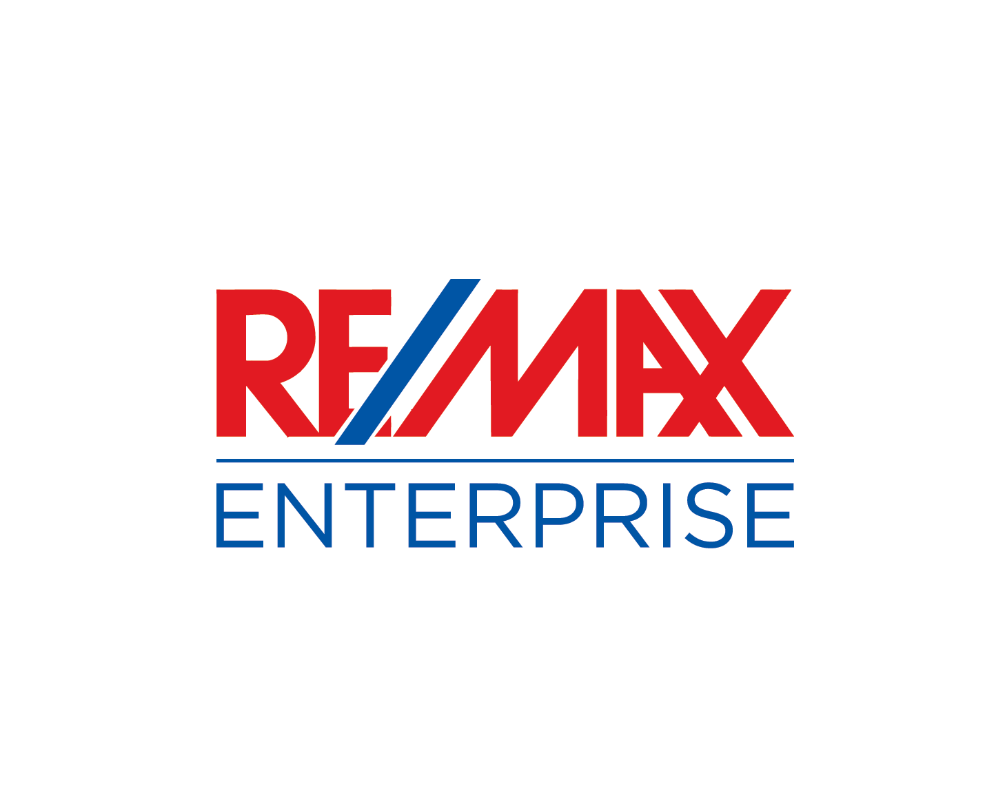
This customer received 157 logo designs from 49 designers. They chose this logo design from Pv_999 as the winning design.
Join for free Find Design Jobs-
 US$200
-
 157 designs
-
 49 designers
Logo Design Brief
RE/MAX Enterprise is an independently-owned and operated franchise real estate brokerage office of RE/MAX. We would like a logo that marries the RE/MAX logotype with our Enterprise brand in two different versions, a "square-ish" logo with the RE/MAX logotype above the word "Enterprise" and a more horizontal version with the RE/MAX logotype to the left and "Enterprise" to the right. We will want to use both of these versions both in black and white and in color, for print and on the web. It's very important that we will be able to use the final versions in a variety of sizes and resolutions without losing too much sharpness.RE/MAX has very stringent graphics and trademark standards that we are obliged to follow. I have attached the six pertinent pages of the graphics manual, including the specifications concerning: the RE/MAX logotype; the color palette; the fonts; and the incorporation of an office name with the RE/MAX logotype. Please ensure that the design conforms to these specifications. Especially take note of the "clear space" requirements around the logotype.We are visualizing a simple logo with the RE/MAX logotype unified with the word Enterprise (in upper and lower-case) reversed out in a rectangle. I am attaching a pdf of the basic concept that we came up with. In conformance with the color palette specifications, the letters in the RE/MAX logotype must be Pantone 186 red and the slash mark must be Reflex Blue. We were thinking that the rectangle around the word Enterprise should be Pantone 289, but would consider alternatives from the approved colors.We prefer the GOTHAM typeface for the word Enterprise, but if you do not have that available, Arial is the only other font that is approved.Please note that when used with an office name, the trademark symbol on the RE/MAX logotype is to be dropped.In addition to the graphics manual and our draft, I am forwarding eps files of the RE/MAX logotype in color and in black and white.I think this covers it. Sorry there's not much scope for your creativity. The challenge, I guess, will be to bring your full talents to bear within such very narrow parameters. Good luck and thank you!
Industry/Entity Type
Real Estate
Logo Text
RE/MAX Enterprise
Logo styles of interest
Wordmark Logo
Word or name based logo (text only)
Lettermark Logo
Acronym or letter based logo (text only)
Font styles to use
Other font styles liked:
- Gotham or, if not available, Arial
Look and feel
Each slider illustrates characteristics of the customer's brand and the style your logo design should communicate.
Elegant
Bold
Playful
Serious
Traditional
Modern
Personable
Professional
Feminine
Masculine
Colorful
Conservative
Economical
Upmarket
Requirements
Must have
- 1. Conform to RE/MAX Corporate Graphics and Trademark standards. Pertinent pages of standards manual are attached.
- 2. Two versions of the logo, one square and one horizontal, both versions available in black and white and in color.
Should not have
- Colors or fonts that don't conform to the Graphics Standard. Any alteration to the RE/MAX logotype except removing the trademark symbol.