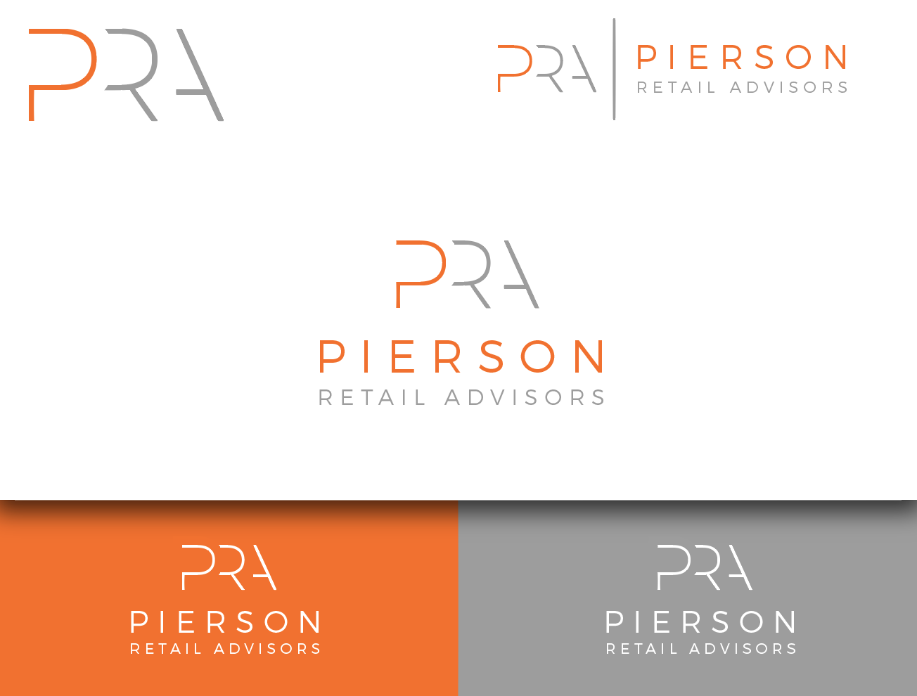
Pierson Retail Advisors Logo for a commercial real estate company selling shopping centers
Want to win a job like this?
This customer received 49 logo designs from 23 designers. They chose this logo design from wonderland as the winning design.
Join for free Find Design Jobs-
 US$160
-
 49 designs
-
 23 designers
Logo Design Brief
We need a logo for a commercial real estate company. We like a clean modern design and we use the acronym PRA. We would like to consider using PRA in our logo but we do not have to. We primarily sell shopping centers but do not want the logo to box us into doing just that. We sometimes sell office buildings and warehouses. Our client pool is virtually all men so we do not want anything too feminine or frilly. We are professional and deal in the world of capital makets....heavy finance. But we are not stuffed shirts. Think sophistication with a bit of flair. In style I would liken us to Audrey Hepburn but sexy, not Madonna. If we were a house, we would have clean modern lines with warm brown wood, lots of books and peonies flowers throughout....clean but soft. We sell properties that range from $1M-$30M in value. Please visit our website to understand our design tastes: PiersonRetailAdvisors.com
Target Market(s)
Commercial Real Estate Investors
Industry/Entity Type
Real Estate
Logo Text
PRA or no text at all
Logo styles of interest
Abstract Logo
Conceptual / symbolic (optional text)
Lettermark Logo
Acronym or letter based logo (text only)
Font styles to use
Colors
Colors selected by the customer to be used in the logo design:
Look and feel
Each slider illustrates characteristics of the customer's brand and the style your logo design should communicate.
Elegant
Bold
Playful
Serious
Traditional
Modern
Personable
Professional
Feminine
Masculine
Colorful
Conservative
Economical
Upmarket
Requirements
Must have
- the colors grey and orange, as shown on my website: PiersonRetailAdvisors.com
Nice to have
- Clean, modern feel. less is more. our audience is all men. it should be more masculine than feminine.
Should not have
- nothing frilly or kitchie. should be more masculine than feminine.