Design for "Thrust" protein health bars wrappers
Want to win a job like this?
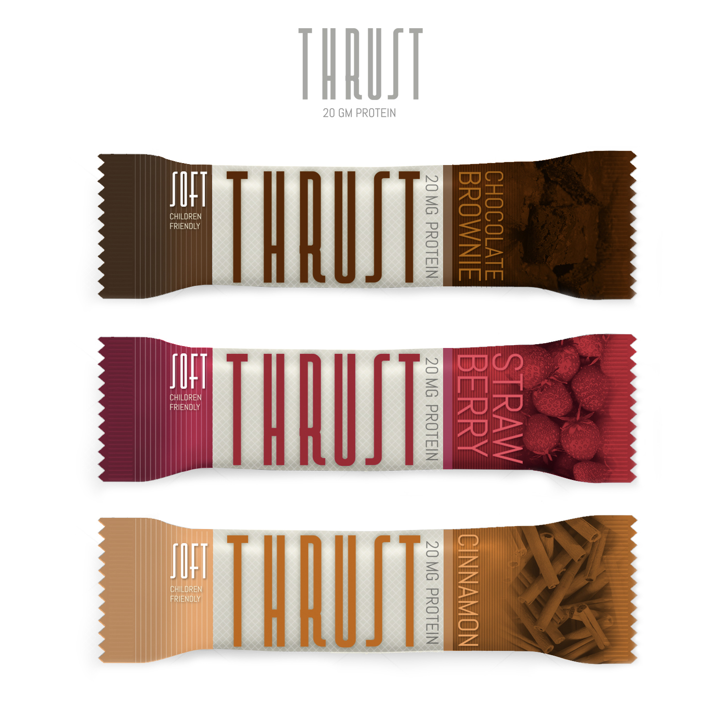
This customer received 108 packaging designs from 25 designers. They chose this packaging design from Handsome Joe as the winning design.
Join for free Find Design Jobs- Guaranteed
- Bundled Project 1
-
 US$490
-
 108 designs
-
 25 designers
Packaging Design Brief
I need a new design for a protein bar that my partners and I are launching for the North American and European markets.
The bar's name is "Thrust."
Given the masculine/aggressive nature of that name, we are thinking of neutralizing it with a more feminine/soft font and design. But hey - the sky is the limit. We obviously want this 20-gram protein bar to sell to a wide net (not just men but women also). So if it means having a Marvel Comic font/design (or whatever) in order to do this, so be it. I leave it up to your intelligence and experience.
ADDED ON FEBRUARY 24:
The official name of the bar is just "THRUST" (not "Thrust Protein").
We have six flavors divided into two categories, which are 1) SOFT and 2) CRUNCHY.
So, the idea is to make two similar designs for the wrapper that still distinguish themselves from each other because one is 'soft' and the other is 'crunchy.'
Then, within each category, the idea is to have three color variations, designating the three flavors in each category.
Please look at the dimensions and examples of the generic wrapper designs that we already have (and which we find too generic), which I have uploaded.
Target Market(s)
North America - Costco, Whole Foods
Europe - Norway, Sweden, Denmark, Germany, France, Switzerland, Italy.
Industry/Entity Type
Nutrition
Logo Text
Thrust
Font styles to use
Colors
Colors selected by the customer to be used in the logo design:
Look and feel
Each slider illustrates characteristics of the customer's brand and the style your logo design should communicate.
Elegant
Bold
Playful
Serious
Traditional
Modern
Personable
Professional
Feminine
Masculine
Colorful
Conservative
Economical
Upmarket
Requirements
Must have
- The title is "Thrust".
- We have six flavors divided into two categories, which are 1) SOFT and 2) CRUNCHY.
- You can work on the two different types of similar-but-different designs for the "soft" and for the "cruncy." Then it's just a question of color variations for each flavor.
- The flavors are:
- SOFT: 1) strawberry, 2) Chocolate brownie, 3) Cinnamon Crunch
- CRUNCY: 1) Peanut, 2) Lemon, 3) Coconut.
- On the side or at the bottom, there should be stated:
- "20 gm protein"
- "children friendly"
Nice to have
- Obvious: a design that catches the eye and inspires someone to buy the bar to eat it.
- Part of the design could include a photograph of the actual bar (you can use generic photos for that until we place a pic of the actual bar). Like 1/4th of the total surface (or even a little smaller).
Files
Download all files - 0.7 MB
Payments
Total
US$490
Project Deadline
04 Mar 2016 18:40:18 UTCProject Upgrades
Bundled project(s)
- offering US$69 logo design to winner