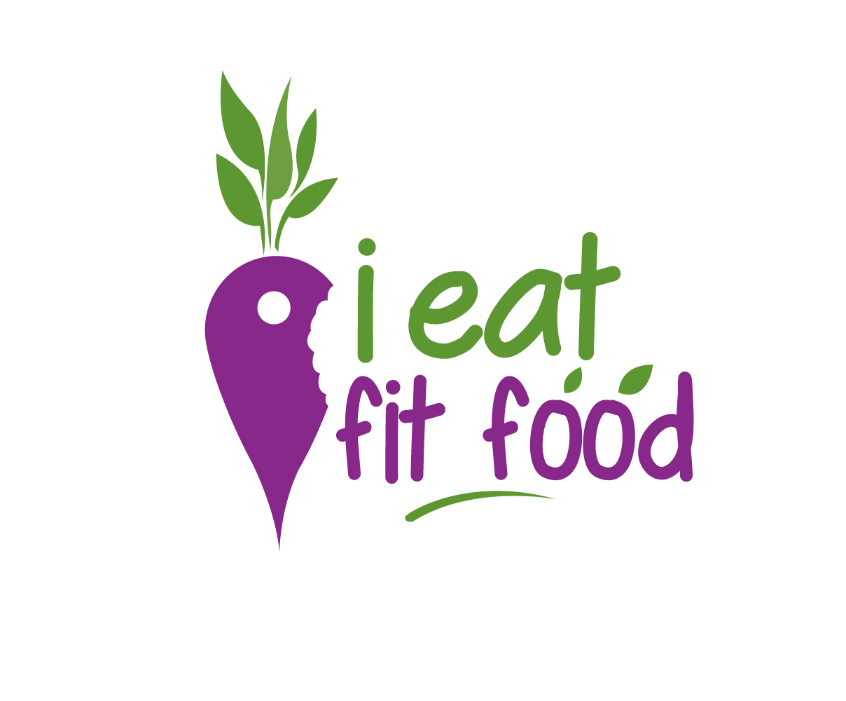
"i eat fit food" mobile application logo design
Want to win a job like this?
This customer received 69 logo designs from 34 designers. They chose this logo design from Graphicsexpert as the winning design.
Join for free Find Design Jobs-
 US$160
-
 69 designs
-
 34 designers
Logo Design Brief
The project is for an online mobile application that locates diet compliant food (healthy meals) when eating out at restaurants. The logo design will be used digitally as well as on printed media. The logo should look professional and sleek. Please use maximum of 2 colors. The company name is 'i eat fit food'. Since this will be a mobile application, it is very important for the icon of the logo to be of equal width and height in pixels.
Target Market(s)
The target market are health conscious individuals or individuals with diet intolerance such as lactose intolerant, or gluten intolerant. These individuals are 18-45 years old. They eat out most of the time and usually do not know or cannot find diet compatible meals.
Industry/Entity Type
Online
Logo Text
i eat fit food (all small caps)
Logo styles of interest
Pictorial/Combination Logo
A real-world object (optional text)
Colors
Colors selected by the customer to be used in the logo design:
Look and feel
Each slider illustrates characteristics of the customer's brand and the style your logo design should communicate.
Elegant
Bold
Playful
Serious
Traditional
Modern
Personable
Professional
Feminine
Masculine
Colorful
Conservative
Economical
Upmarket
Requirements
Must have
- Since the icon of the logo will be used for a mobile application, it is important, size wise, for the icon to be compatible with using it as a mobile application icon. These are usually equal in width and height.
- Since this is an application used to 'locate' diet compliant meals, the icon of the logo should also contain the locator symbol. I attached sample locator symbols for reference. The locator symbol should not be the focus of the logo. It should be an auxiliary item that complements the overall theme of the logo.
- Design needs to be simple, communicate company overall message, memorability to make it easier for people to remember.
Nice to have
- The logo should have a limited number of colors. A maximum of 2 colors is preferred.
- I would also like to incorporate the beetroot symbol into it if possible. The locator symbol could be the purple section of the beetroot. I added images for reference.
Should not have
- Non-professional fonts