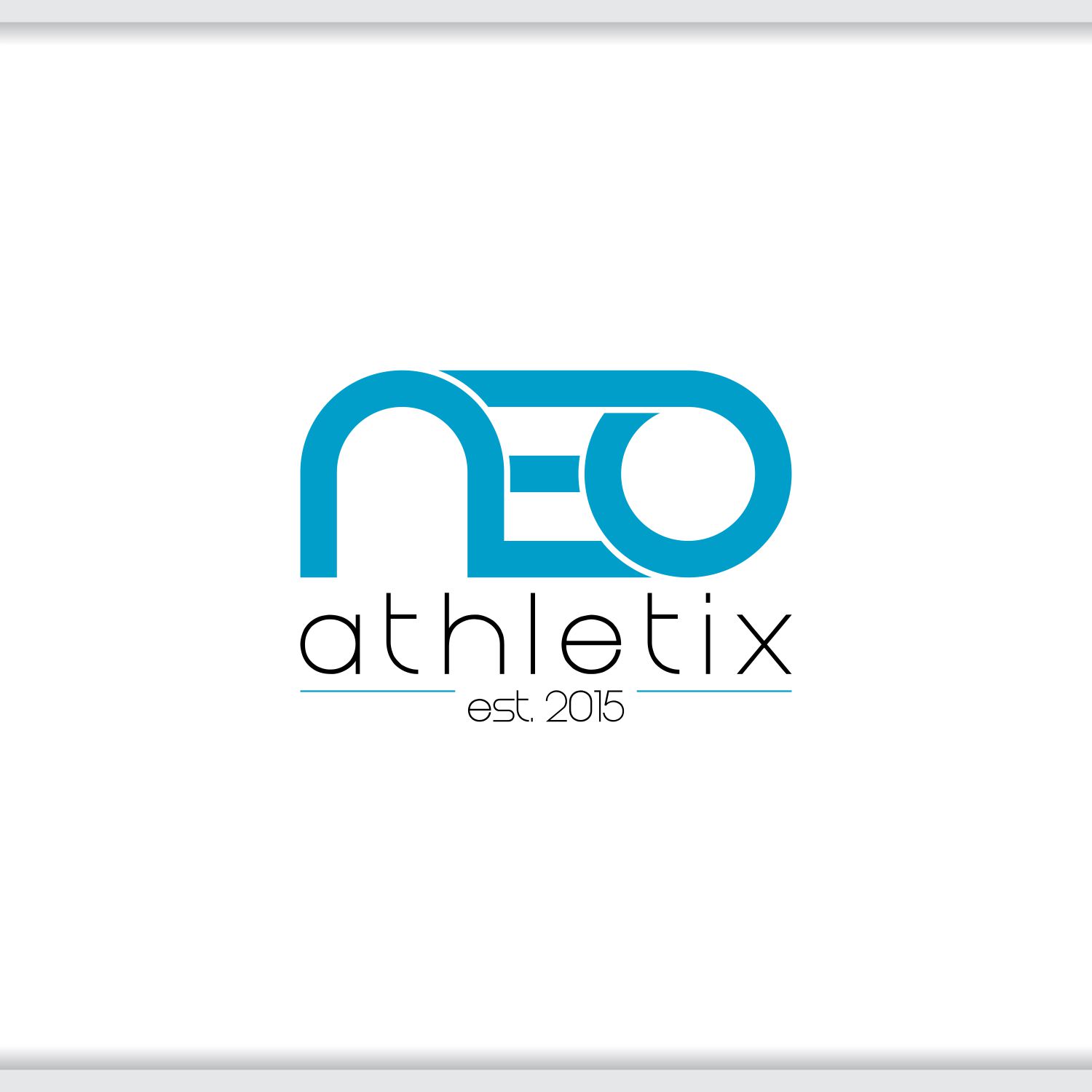
NEOathletix Logo
Want to win a job like this?
This customer received 54 logo designs from 19 designers. They chose this logo design from Creator as the winning design.
Join for free Find Design Jobs-
 US$170
-
 54 designs
-
 19 designers
Logo Design Brief
We are a reformed CrossFit gym, now called NEOathletix. NEO stands for: nutriton, exercise, optomized. We would like that to be incorporated in the logo if at all possible.
Our gym focuses on attention to detail, family atmosphere, and open-minded concept to stay on the edge of fitness theory.
Currently our location is in San Juan Capistrano, California. Our city animal is the swallow (bird) and the icon is The Mission (church).
Our gym is rectangular shaped with a roll-up door in the back (industrial style) - one of the long sides is faced with diamond plates. The other side is wood and chalk-board.
We would like our accent color to be #0066ff.
We are looking for designs that can also be used for stickers, shirts, hats, etc.
Target Market(s)
mid 20's- mid 50's. Middle to upper class.
Industry/Entity Type
Gym
Logo Text
NEOathletix est. 2015
Logo styles of interest
Emblem Logo
Logo enclosed in a shape
Abstract Logo
Conceptual / symbolic (optional text)
Wordmark Logo
Word or name based logo (text only)
Colors
Colors selected by the customer to be used in the logo design:
Look and feel
Each slider illustrates characteristics of the customer's brand and the style your logo design should communicate.
Elegant
Bold
Playful
Serious
Traditional
Modern
Personable
Professional
Feminine
Masculine
Colorful
Conservative
Economical
Upmarket
Requirements
Must have
- Other colors in our gym are gray and black. We would like to limit the colors to blue, black, gray and white. The color of the watch in the picture attached is the blue that we would like to go with.
Nice to have
- Something with a little bit of a rustic vibe.
Should not have
- distracting icons/pics/illustrations