New design for www.BarberBooking.com
Want to win a job like this?
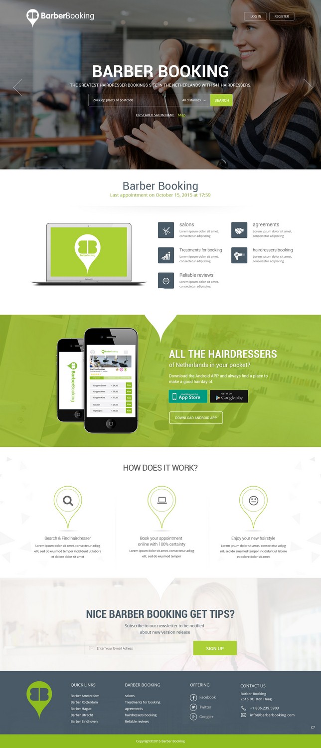
This customer received 100 web designs from 18 designers. They chose this web design from pb as the winning design.
Join for free Find Design Jobs- Guaranteed
-
 €305
€305
-
 100 designs
-
 18 designers
Web Design Brief
On BarberBooking you can find & book your hairdresser. BarberBooking is the biggest platform in the Netherlands.
- The design should be a responcive design
- Should be able to go global, should fit in perfectly between all the big booking platforms like airbnb, uber etc,
- Should have te result of more bookings. :)
- We are ‘only’ asking a beautiful design, not a technical solution.
- We need a homepage (https://barberbooking.com/), search resultpage ((https://barberbooking.com/kapper/amsterdam/#), salonpage (https://barberbooking.com/kapper/vorden/da-vinci-for-hair/), about us page (https://barberbooking.com/aboutus/), for the hairdresser info page (https://barberbooking.com/kapper/), login/register page (https://barberbooking.com/account/signin/).
- On the page of the hairdresser there is a dynamic part. The part where you create your appointment. Please take a look at this part too after you choose your treatment (behandeling), employee (medewerker), Date (datum) and time (tijd). The part that you see after this, is the part where you fill in your data as a consumer.
I've added more logo's but mostly we use the green color.
A few of our competitors: www.treatwell.com, www.wahanda.com
Target Market(s)
All consumers
Industry/Entity Type
Hair And Beauty
Number of Pages Required
5+ page
Font styles to use
Colors
Colors selected by the customer to be used in the logo design:
Look and feel
Each slider illustrates characteristics of the customer's brand and the style your logo design should communicate.
Elegant
Bold
Playful
Serious
Traditional
Modern
Personable
Professional
Feminine
Masculine
Colorful
Conservative
Economical
Upmarket
Requirements
Must have
- Responsive
- We did an A/B test with the homepage. It turns out that option B works better then option A (take a look at the uploaded pictures). So what we need on the homepage: The USP's with the green checkboxes, The search button needs to by dynamic (changes for example from light green to dark green so you can see you can click it) The call to action sentence Zoek & Vind je kapsalon, the searchfield and searchbutton should be seperated.
Nice to have
- The style that we like is the flat design style. The website should be simple, clean and it should feel a bit like a luxury thing. Because an appointment with the hairdresser can be a real treat and luxury moment for yourself.
- The luxury feeling and flat design that is in the www.uber.com website is really nice for example. But then it has to be a bit more light and not so black and dark.