Only for Pros: Interior Design Logo.. The Right Logo
Want to win a job like this?
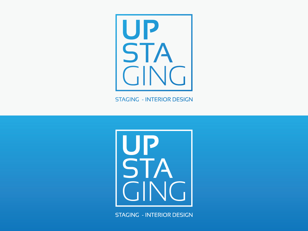
This customer received 154 logo designs from 36 designers. They chose this logo design from ICreativeCreations as the winning design.
Join for free Find Design Jobs- Guaranteed
-
 US$310
-
 154 designs
-
 36 designers
Logo Design Brief
This project is only intended for Expert Level of Design
Introduction:
I'm starting a staging/interior design business in Washington DC, the company will be providing Interior Design and furniture rental for real state, the purpose of the company is to decorate a vacant house/apartment to better showcase and increase it's value.
That means the result of our work comes in a 100% from the "visual" impact we create, from the interior design, and it is the mission of the company to always present a beautiful result that will completely satisfy our client's expectations.
Objective:
That is why I'm presenting the task of designing the company logo to qualified individuals, this is meant only for those with the talent and vision necessary to see the task to it's completion in a way that would exceed my expectations.
The company's name is Upstaging, and the name should appear in the logo, this name symbolizes our mission, to always let our work stand out by itself, and that's the "image" the logo should project.
The overall image:
Eye catching, elegant, rich, creative, innovative... More than just a logo this should be considered a concept to brand our image, eventually people should be able to see just our logo and know it's us, this concept will be also used for our website which is a project to be considered next.
I've thought of three options as far a disposition of Logo vs Company Name:
1. Merge Company Name and Logo (name=logo)
In this option the Company Name will be elevated from just a name to the actual logo itself, see attached file from Mister Cooper as an example of this.
2. Company Name is Under Logo (centered)
In this option the Company name will go under the Logo as showed in the attached file from Glaslyn Consulting.
3. Company Name is to the right of the Logo
In this option the Company Name will go to the right of the logo as showed in the file from Nordhagen Multimedia.
- Note that in both the second ant third option the Company Name's color and letter type complements the logo.
Pointers:
Feel free to bring your expert opinion and input ideas and suggestions.
When it comes to colors I don't have a favorite yet, I think the color should complement the design and altogether be represented in harmony, so be ready to surprise me with different options.
There should be a color version, as well as a version in back (grey scale), and a version in solid white.
The Logo should be ORIGINAL, that is, not to be the product of some previous or also called "recycled" project.
You are encouraged to use highlights and shadows to give the project depth and movement if necessary.
Here are the DON'Ts of this project:
No turning the letter U into an ascending arrow
No cartoons
No house silhouette (I don't want the drawing of a little house)
No furniture related (I don't want the drawing of a sofa or a lamp)
No powerpoint/highschool student quality
If you have come to this point and still feel interested in the project then you are my kind of person, I encourage you to take the challenge and get creative!
Take your time and feel free to ask me as many questions as you need, I'm not sure if I have been explanatory enough.
I'm excited about this!
Target Market(s)
Real Estate Firms
Industry/Entity Type
Business
Logo Text
Upstaging
Logo styles of interest
Abstract Logo
Conceptual / symbolic (optional text)
Wordmark Logo
Word or name based logo (text only)
Look and feel
Each slider illustrates characteristics of the customer's brand and the style your logo design should communicate.
Elegant
Bold
Playful
Serious
Traditional
Modern
Personable
Professional
Feminine
Masculine
Colorful
Conservative
Economical
Upmarket
Requirements
Must have
- Refer to description
Nice to have
- Refer to description
Should not have
- No turning the letter U into an ascending arrow
- No cartoons
- No house silhouette (I don't want the drawing of a little house)
- No furniture related (I don't want the drawing of a sofa or a lamp)
- No powerpoint/highschool student quality