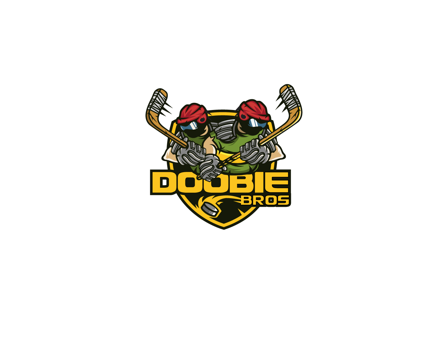
Doobie Brothers Hockey Team New Logo
Want to win a job like this?
This customer received 37 logo designs from 17 designers. They chose this logo design from Oliver Balard as the winning design.
Join for free Find Design Jobs-
 C$160
C$160
-
 37 designs
-
 17 designers
Logo Design Brief
We are a recreational hockey team from Canada, We have been called the Doobie Brothers for over ten years. The double connotation that we we are all close friends and we all get high. We have used symbols in the past from the musical group and our main logo has been "Johnny Zig Zag" the face from zig zag papers. We are looking for a new creative symbol/team logo. It can pretty much be anything, a character, or even just our name in a creative way. It can just be "doobie brothers" and doesn't have to include "the", or it can be shortened to Doobie Bros. or even DB. It can include weed references but doesn't have to. It can include hockey references but doesn't have to. Our colours are mainly dark green with yellow as a secondary colour and red and black aswell. The main purpose for the logo is to go on a white hockey jersey.
Logo Text
Doobie Brothers, Doobie Bros.
Logo styles of interest
Emblem Logo
Logo enclosed in a shape
Pictorial/Combination Logo
A real-world object (optional text)
Character Logo
Logo with illustration or character
Colors
Colors selected by the customer to be used in the logo design:
Look and feel
Each slider illustrates characteristics of the customer's brand and the style your logo design should communicate.