Mailing to North

Want to win a job like this?
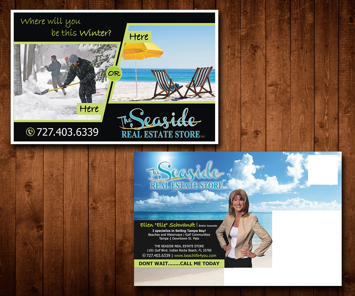
This customer received 14 postcard designs from 4 designers. They chose this postcard design from Designers Hub as the winning design.
Join for free Find Design JobsPostcard Design Brief
I am a Real Estate agent in the Tampa Bay area and I intend to market the postcards to affluent areas of Minneapolis. Who wants to spend another cold, snowy winter in Minneapolis when you can be swimming or golfing and enjoying the sunny beach in Tampa Bay!?
I plan to send out 200 cards to the same people in October, November, December.
Mailing one – two photos
Mailing two – two thermometers
Mailing three – Shoveling snow/golfing
Balance of design stays the same
Preferences –
My Brokers Logo must be as sent – she is adamant about color
I like – Eye catching – light on words, eye catching font and font color (lime green is my fav!). Any snowstorm pic is fine, and I could supply a beach picture if needed. I will also send a pic of myself when I decide which one.
Updates
Project Deadline Extended
Reason: I need to have revisions on the design I want to select !
Added Thursday, September 24, 2015
Target Market(s)
Affluent single family homes that may purchase a winter residence
Industry/Entity Type
Real Estate Agent
Font styles to use
Other font styles liked:
- Bradley Hand, Tahoma - just suggestions, not in stone
Colors
Colors selected by the customer to be used in the logo design:
Look and feel
Each slider illustrates characteristics of the customer's brand and the style your logo design should communicate.
Elegant
Bold
Playful
Serious
Traditional
Modern
Personable
Professional
Feminine
Masculine
Colorful
Conservative
Economical
Upmarket
Requirements
Must have
- My broker's name, My contact information, my photo
Nice to have
- Bold backgrounds (black?). Bold Font style and color but easy to read - I want them to LOOK and READ it. Do not want it to wordy - Keep it to the point!!!