PLAY needs a simple, contemporary and easy to use 'designer' website (fully working/coded)
Want to win a job like this?
This customer received 50 web designs from 7 designers. They chose this web design from Vedanta Web Solutions as the winning design.
Join for free Find Design Jobs- Guaranteed
-
 US$500
-
 50 designs
-
 7 designers
Web Design Brief
PLAY is a progressive market research consultancy based in Sydney, Australia. We are a new company and require a contemporary/modern and bold, uncomplicated/simple, clean/uncluttered site, which uses friendly and easy to read fonts. The brand is approachable. The colour palate should be simple and contemporary. Colours used in our logo are:#FFCC00 and #404041 so any others should complement these.
The following website gives a really good idea of how simple the site should be: www.theleadingedge.com.au and I am looking to create something similar to this style of site (but not necessarily copied).
The website should convey ‘different types of customer’. PLAY helps different companies ‘connect’ with their particular shoppers or end users of their product. This could be a mum doing the washing, a dad cleaning the car, children eating ice cream, old people reading the newspaper, someone trying on glasses, someone buying petfood etc. Alternatively it could simply just be pictures of different people…different ages, different nationalities, different employment types etc, but they should give a positive impression (ie people smiling/laughing) and also GREAT quality photos.
Content will also be attached but please note this is just a draft reference and will be sent to a copywriter for improvement. The telephone number is yet to be confirmed but will be given at the end of the contest.
The navigation may borrow strongly from www.theleadingedge.com.au. It may have the following navigation panel:
ABOUT US
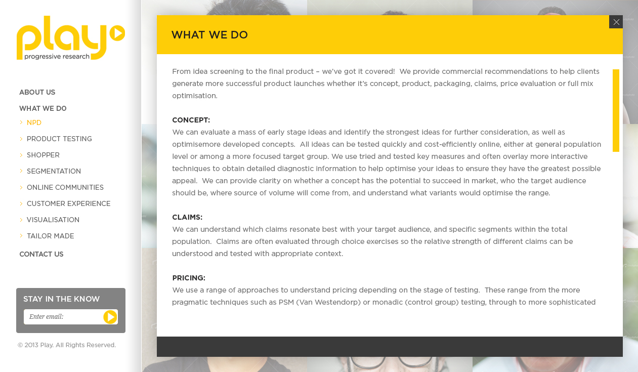
WHAT WE DO
> NPD
> PRODUCT TESTING
> SHOPPER
> SEGMENTATION
> ONLINE COMMUNITIES
> CUSTOMER EXPERIENCE
> VISUALISATION
> TAILOR MADE
CONTACT US
The home page may be WHAT WE DO and each picture represents one of the 8 sections (such as NPD) etc.
One of my main objectives is also to get people to sign up to my quarterly newsletter, so would like to make this very visible, and make it easy for them to connect via linkedin.
I will also want to add a blog page in September (so needs to be hidden now but switched on in Sept). This blog will contain articles from the newsletters and linkedin updates. I may also want to add a simple 90-180 second video at the bottom of each of the 8 sections (to be added over the next 12 months but i would like to ensure it is possible to do this at a later stage).
The logo has recently been designed and i have attcahed different colour versions as i may be swayed depending on hoe they look in te website. I tend to prefer yellow on white, or white on yellow but other optins are included if you think they work better with your design.
Target Market(s)
Professionals in large blue chip companies..such as coca cola, nestle, unilever etc. Marketing Managers/Directors, PR and advertising agencies etc.
Industry/Entity Type
Progressive
Look and feel
Each slider illustrates characteristics of the customer's brand and the style your logo design should communicate.
Elegant
Bold
Playful
Serious
Traditional
Modern
Personable
Professional
Feminine
Masculine
Colorful
Conservative
Economical
Upmarket
Requirements
Must have
- High quality positive photos. Be very easy to navigate...should scream simple!