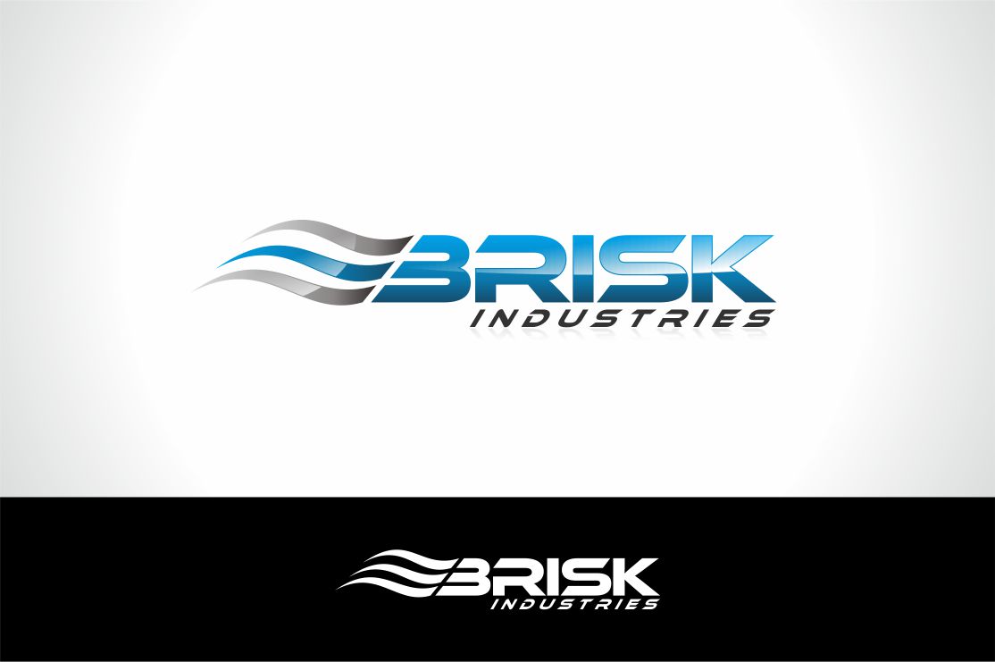
Brisk Industries
Want to win a job like this?
This customer received 15 logo designs from 10 designers. They chose this logo design from Robby SC as the winning design.
Join for free Find Design Jobs-
 US$200
-
 15 designs
-
 10 designers
Logo Design Brief
We are looking for a corporate logo for our new company to be used on Websites, Business Cards etc.
The definition of Brisk is to be fast and articulate, most important it means to be
COOL BUT COMFORTABLE
My thought on this was that cool and Comfortable reminds me of Wind (Quick Breeze) a feel good breeze.
I was thinking about the element wind and in ancient times it was described as 3 squiggly lines. Blues and Silvers in color.
The B for Brisk could possibly have wind inside of it or before and running into it!
Or even behind Brisk and Industries.
Updates
I have seen several designs that used the root BRISK but not much creativity with the wind and the choice of font. One designer has done a tremendous job and used my idea of having the fancy B and captured the wind as cool and comfortable.
Added Saturday, May 11, 2013
Target Market(s)
Fortune 500 Companies for clients Business & Home owners for customers
Industry/Entity Type
Business
Logo Text
Brisk Industries
Logo styles of interest
Emblem Logo
Logo enclosed in a shape
Pictorial/Combination Logo
A real-world object (optional text)
Look and feel
Each slider illustrates characteristics of the customer's brand and the style your logo design should communicate.
Elegant
Bold
Playful
Serious
Traditional
Modern
Personable
Professional
Feminine
Masculine
Colorful
Conservative
Economical
Upmarket
Requirements
Must have
- Capital B and Capital I
Wind or the motion of wind