1st Logo needed for New Real Estate Due Diligence Company
Want to win a job like this?
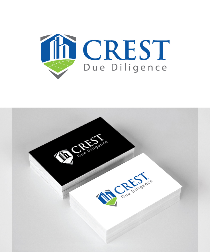
This customer received 67 logo designs from 13 designers. They chose this logo design from Ajay Soni as the winning design.
Join for free Find Design Jobs-
 US$160
-
 67 designs
-
 13 designers
Logo Design Brief
CREST Due Diligence stands for Clifton Real Estate Services & Technologies. I started doing this in 2009 and have officially started doing business as CREST in the recent months. I will be rolling out the company name, logo and my new business to all my clients this summer. I conduct dual scope real estate due diligence inspections/ assessments of all types of properties including undeveloped land, retail shopping centers, commercial office high rises, hotels/ resorts, healthcare facilities and industrial warehouse properties. Dual scope consists of an environmental site assessment and a property condition assessment. The Environmental assessments include evaluating risks at a property to human health and the environment (mold, asbestos, property contamination, etc.) The Property condition assessments are effectively a more detailed version of a home inspection and have similar value propositions. They identify deficiencies and associated repair/replace costs in a property. Basically… With the Environmental Assessment, I am looking at the outside factors that are going to impact the property, while the Property Condition Assessment is evaluating the condition of the features of the property.
I had in mind the idea using something similar to a “family crest” or shield shape (not specifically Clifton) that was divided into 2 sides (side by side or top & bottom or angled) to symbolize the dual scope projects that I do. Could also have it divided into 4 quadrants and 2 are left as solid colors and other 2 have symbols. However, I do not want a very intricate & busy crest/symbol with lots of different patterns and symbols all over it. Maybe one symbol that depicts environment and one symbol that depicts the properties.
I like the tradition and heritage that a crest image represents, but I want something updated with a modern twist. I am curious to see your take on a crest or shield, so I am also open to your interpretation or any other ideas you might have!
Overall Look: clean, masculine, natural (but not soft), bold, eye catching, simple
Symbol plus words
Colors: black/grey, blue and green
Logos I like:
http://www.designcrowd.com/design/4962895
And others attached.
Target Market(s)
Real Estate companies, Banks, Other Environmental Consulting Firms
Industry/Entity Type
Business
Logo Text
CREST Due Diligence
Logo styles of interest
Emblem Logo
Logo enclosed in a shape
Pictorial/Combination Logo
A real-world object (optional text)
Font styles to use
Colors
Colors selected by the customer to be used in the logo design:
Look and feel
Each slider illustrates characteristics of the customer's brand and the style your logo design should communicate.
Elegant
Bold
Playful
Serious
Traditional
Modern
Personable
Professional
Feminine
Masculine
Colorful
Conservative
Economical
Upmarket
Requirements
Must have
- Company Name - symbol plus words (pictorial/ combo logo or possibly emblem logo)
- Overall Look: clean, masculine, natural (but not soft), bold, eye catching, simple
- Colors: black/grey, blue and green
Nice to have
- I had in mind the idea using something similar to a “family crest” or shield shape (not specifically Clifton) that was divided into 2 sides (side by side or top & bottom or angled) to symbolize the dual scope projects that I do. Could also have it divided into 4 quadrants and 2 are left as solid colors and other 2 have symbols. However, I do not want a very intricate & busy crest/symbol with lots of different patterns and symbols all over it. Maybe one symbol that depicts environment and one symbol that depicts the properties.
- I like the tradition and heritage that a crest image represents, but I want something updated with a modern twist. I am curious to see your take on a crest or shield, so I am also open to your interpretation or any other ideas you might have!
Should not have
- Should not be too busy. 2 colors with black/grey. I noted several shared below, but blue and green tones for color are preferred. Or one color is fine too.