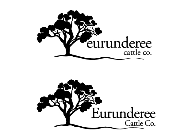
New logo for an Australian cattle breeding company
Winner
Want to win a job like this?
This customer received 40 logo designs from 24 designers. They chose this logo design from Tammy Moore as the winning design.
Join for free Find Design Jobs-
 A$160
A$160
-
 40 designs
-
 24 designers
Logo Design Brief
We need a new logo for a family owned and run cattle breeding company called 'Eurunderee Cattle Co'.
Our thoughts are that we would like to keep the design quite simple and in black and white (black script/image on a white background) so it will be easily used across a variety of applications; web, email, stationary, uniforms, signage etc.
We are hoping the new logo will communicate a simple bold confidence while also elegantly linking the brand to nature/life/sustainability.
Industry/Entity Type
Agriculture
Logo Text
Eurunderee Cattle Co.
Logo styles of interest
Wordmark Logo
Word or name based logo (text only)
Font styles to use
Serif
Look and feel
Each slider illustrates characteristics of the customer's brand and the style your logo design should communicate.
Elegant
Bold
Playful
Serious
Traditional
Modern
Personable
Professional
Feminine
Masculine
Colorful
Conservative
Economical
Upmarket
Requirements
Nice to have
- We would like the name 'Eurunderee' to be larger and the main focus of the logo, with the words ' Cattle Co.' smaller, below and right hand justified.
- We like the idea of a simple line image of a tree next to the name 'Eurunderee', potentially with its roots under scoring the name.
- If possible, we would like an Australian Eucalyptus tree used, preferably the White box/Eucalyptus Albens (this is the tree that dominates the landscape of the main property of this company, hence its property name 'Box Range').
- A possible alternative to the tree could be a simple line drawing of the White box eucalyptus flowers, seed pods and leaves used in a similar way.
- We like the look of a slightly fancier script such as 'Times new roman' etc. and have played with the first letter 'E' being a larger size than the rest of the letters, wile still keeping all letters in capitals.
Should not have
- We would like to keep the design simple enough that we would be able to embroider it on uniforms rather than print.
Files
Download all files - 2.4 MBJPG
IMAG1975 Saturday, 13 June 2015 01:15:10
Saturday, June 13, 2015
JPG
IMAG1972 Saturday, 13 June 2015 01:15:16
Saturday, June 13, 2015
JPG
IMAG1974 Saturday, 13 June 2015 01:15:23
Saturday, June 13, 2015
JPG
IMAG1973 Saturday, 13 June 2015 01:15:21
Saturday, June 13, 2015
Payments
1st place
A$160