Warwick orthopaedic specialist training programme (WOSTP)
Want to win a job like this?
This customer received 63 logo designs from 9 designers. They chose this logo design from sumarnishadi as the winning design.
Join for free Find Design Jobs- Guaranteed
-
 £120
£120
-
 63 designs
-
 9 designers
Logo Design Brief
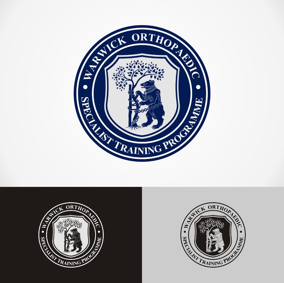
WOSTP is a postgraduate trading programme for trauma and orthopaedic surgeon based in Coventry and Warwickshire in the UK. We would like a logo to increase our identity and solidify the gravitas and importance of the programme as it enters its tenth year. there should be a black and white logo for letter heads and watermarks in documents and a colour logo of the same which should be able to be used on ties, enamel badges and cuff links etc. Symbols to be included should include those relating to the geographical area and therefore the bear and ragged staff of Warwickshire and the red and green colours of the Coventry coat of arms. The tree of Andry is the international symbol of orthopaedics and should be included if possible. It might be possible to combine the bear, rugged staff and tree in some overarching theme. The overall feeling should be heraldic or historic in nature. The circular Oxford university crest might be a ideal to aspire to. I attach some images I have taken cues from and my own very amateurish efforts.
Target Market(s)
Internal use on letterheads , course leaflets etc
Industry/Entity Type
Training
Logo Text
Warwick Orthopaedic Specialist Training Programme
Logo styles of interest
Emblem Logo
Logo enclosed in a shape
Font styles to use
Look and feel
Each slider illustrates characteristics of the customer's brand and the style your logo design should communicate.
Elegant
Bold
Playful
Serious
Traditional
Modern
Personable
Professional
Feminine
Masculine
Colorful
Conservative
Economical
Upmarket
Requirements
Must have
- Strong logo, gravitas, longevity
Nice to have
- Black and white version
Should not have
- Anything too gimmicky or fashionable