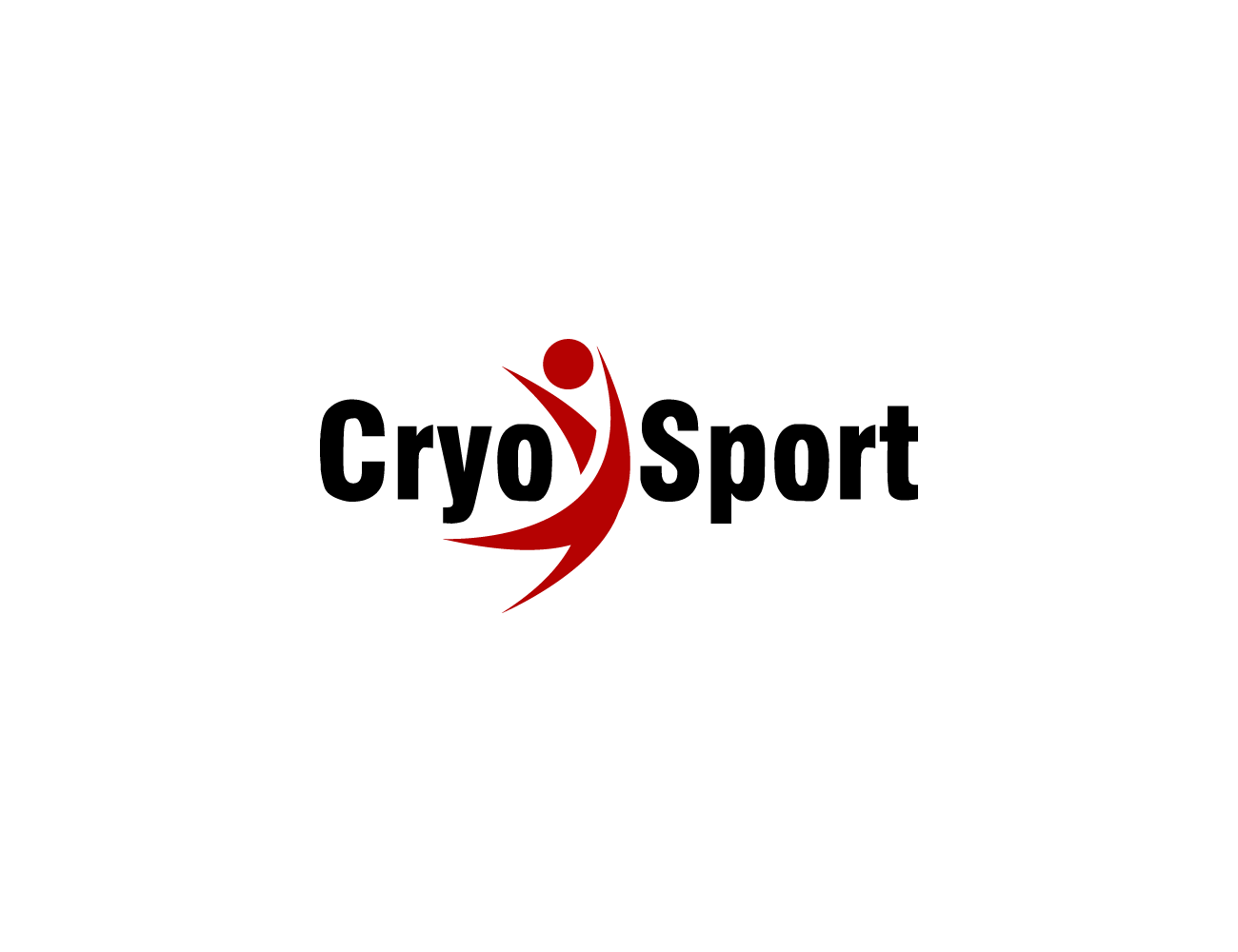
CryoSport Sports Medicine Cryotherapy logo
Want to win a job like this?
This customer received 31 logo designs from 17 designers. They chose this logo design from NDRO as the winning design.
Join for free Find Design Jobs-
 US$160
-
 31 designs
-
 17 designers
Logo Design Brief
ChiroSport Specialists of Dallas is a sports medicine, rehab and fitness facility with multiple locations in the Dallas metroplex. We serve athletes of all skill levels, and have just expanded to include our new cryotherapy business, CryoSport. We would love a talented designer to take our existing ChiroSport title/logo, and work up something for CryoSport that mirrors its parent company's graphic image, while also incorporating aspect of cryotherapy. (If you are unfamiliar, cryotherapy is simply exposing the body to sub-zero temps for a short time, while encased in a capsule running off of liquid nitrogen. Temps fall as low as -175!) We want this logo to appear very parallel to our existing logo (ex: use our little "Chiroguy" and similar font) while still finding a way to set the CryoSport brand apart in its own "cool" way! Color scheme would either be the existing red/white/black matching our primary logo, or using an ice blue/white/black scheme and just have the logo VERY similar to our main company logo, so that it still appears the two are very connected. Check out our website at www.chirosportspecialists.com for more on what we do.
Target Market(s)
athletes
Industry/Entity Type
Fitness
Logo Text
CryoSport
Look and feel
Each slider illustrates characteristics of the customer's brand and the style your logo design should communicate.
Elegant
Bold
Playful
Serious
Traditional
Modern
Personable
Professional
Feminine
Masculine
Colorful
Conservative
Economical
Upmarket
Requirements
Must have
- matching fonts to parent company logo, one of the two color schemes listed, "chiro guy" image used in parent company logo