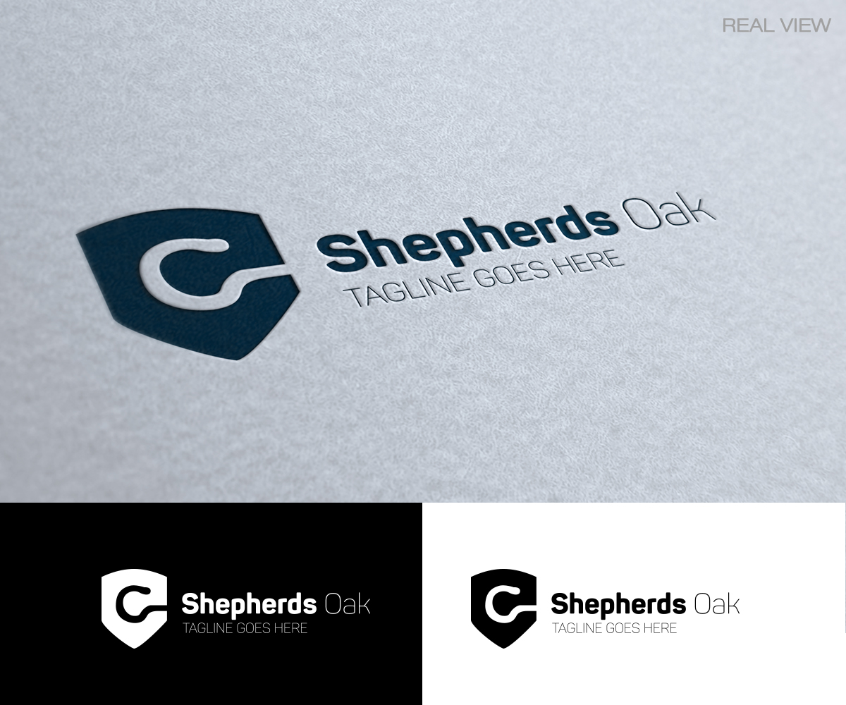
Shepherds Oak
Winner
Want to win a job like this?
This customer received 99 logo designs from 48 designers. They chose this logo design from Tiendesign as the winning design.
Join for free Find Design Jobs- Guaranteed
-
 €375
€375
-
 99 designs
-
 48 designers
Logo Design Brief
The company is a long term investment company - keyword would be passion and patience.
The symbolism that I would like the logo to express, is that shepherds look out for the sheep - and especially holds out the wolves. All the good shepherds are united under the slow growing Oak. There are good shepherds in all generations.
Industry/Entity Type
Investment
Logo Text
Shepherds Oak
Look and feel
Each slider illustrates characteristics of the customer's brand and the style your logo design should communicate.
Elegant
Bold
Playful
Serious
Traditional
Modern
Personable
Professional
Feminine
Masculine
Colorful
Conservative
Economical
Upmarket
Payments
1st place
€375