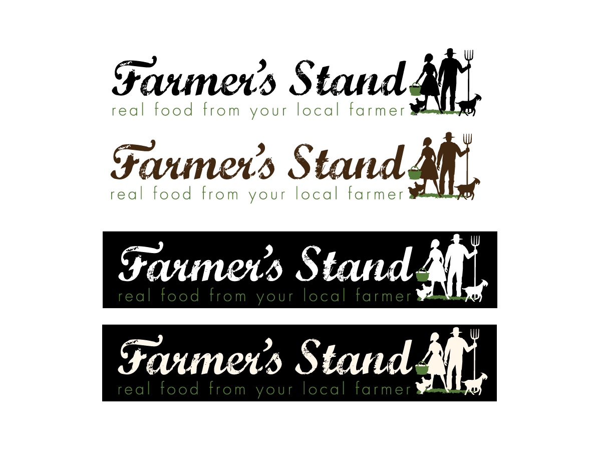
Farmer's Stand - A farmer's market on the web

Want to win a job like this?
This customer received 64 logo designs from 23 designers. They chose this logo design from Patricia Baliviera as the winning design.
Join for free Find Design Jobs- Guaranteed
Logo Design Brief
Hello and welcome to our project.
We need a logo design for our website that is essentially an online farmers' market.
The design we have in mind is basically horizontal and is both 'organic' and represents web 2.0 at the same time (if that's even possible).
The company name embodies two meanings at once. Farmer's Stand represents the traditional farmers' market (see link: http://qwi.ki/if5I9Z). It also represents the local farmers and food artisans 'stand' for their community, lifestyle, expertise and family.
To get an idea of who this logo will represent, please take a look at the farmer photos about half way down this blog: http://bit.ly/jRf2RT (note, these are not my photos so please don't use them). Additionally, there's a bunch of interesting design ideas at this link: http://bit.ly/kDoDlH
We've uploaded the basic text idea of what we're looking for. However, we'd like to give designers creative flexibility and are willing to consider all designs.
Target Market(s)
Our target market are eaters who want to purchase fresh locally grown and produced food opposed to low quality food trucked in from a far away locations (link: http://qwi.ki/ehQUby).
Industry/Entity Type
It Company
Logo Text
Farmer's Stand - real food from your local farmer
Logo styles of interest
Pictorial/Combination Logo
A real-world object (optional text)
Wordmark Logo
Word or name based logo (text only)
Look and feel
Each slider illustrates characteristics of the customer's brand and the style your logo design should communicate.
Elegant
Bold
Playful
Serious
Traditional
Modern
Personable
Professional
Feminine
Masculine
Colorful
Conservative
Economical
Upmarket
Requirements
Must have
- Must have the name of the company (large) 'Farmer's Stand' and the company motto (small) 'real food from your local farmer' at at equal horizontal distance below the company name. See the attached file for our basic thoughts.
Farmer's Stand (large)
Real food from your local farmer (small)
Nice to have
- Unique stylized text for 'Farmer's Stand' portion of the logo. These companies have logos that we like. We especially like the fonts that are some-what ‘worn’ – not sure what it’s called but something similar would possibly look nice for the ‘Farmer’s Stand’ part of the logo.
http://www.doortodoororganics.com/
http://doorstepdairy.com/
http://www.farmersmarketonline.ca/
http://www.freshdirect.com
http://www.gilttaste.com/
http://www.localdirt.com/
http://www.abelandcole.co.uk/
http://www.earthfare.com/
http://www.realtimefarms.com/
http://www.localfoodisbetter.com/
Should not have
- No color backgrounds or borders - this logo background must be translucent for a variety of uses including our website, business cards, documents, various backgrounds, etc. Thanks.