Receive a Bouquet. Avoid a Brickbat. Produce an innovative logo combining text and graphic elements
Want to win a job like this?
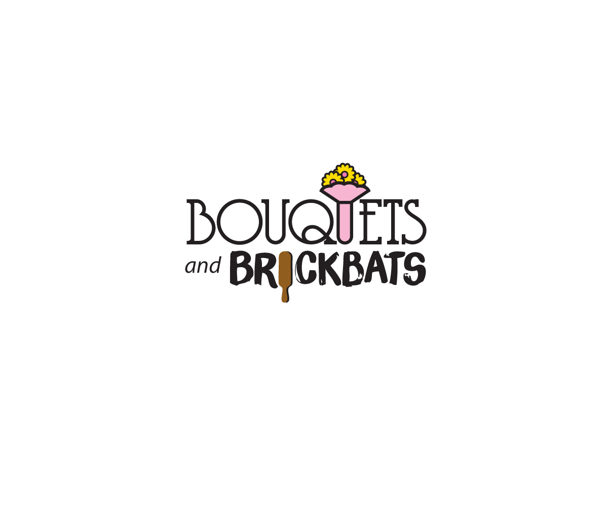
This customer received 23 graphic designs from 11 designers. They chose this graphic design from Buck Tornado as the winning design.
Join for free Find Design Jobs- Guaranteed
-
 A$250
A$250
-
 23 designs
-
 11 designers
Graphic Design Brief
We need a text-based logo for a reviews website called Bouquets and Brickbats. The logo should include two graphic elements in conjunction with the text - a "bouquet" and a "brickbat". These graphic elements will be used separately around the site to designate if a business is good (via a bouquet) or poor (via a brickbat).
The site name comes from a old English phrase that describes whether someone deserves praise or not - ie do they receive a bouquet (of flowers) or a brickbat (a bat or paddle used to "spank" someone!)
.
Updates
Project Deadline Extended
Reason: Further designs required.
Added Friday, March 13, 2015
Target Market(s)
Users (n the vast majority of cases be 45 years of age or older) will be reviewing businesses in a service-based industry. They are quite often affluent and discerning, an even mix of males and females and they appreciate qualities such as diligence, responsiveness, communicativeness, professionalism, kindness, patience and care
Industry/Entity Type
Business
Font styles to use
Look and feel
Each slider illustrates characteristics of the customer's brand and the style your logo design should communicate.
Elegant
Bold
Playful
Serious
Traditional
Modern
Personable
Professional
Feminine
Masculine
Colorful
Conservative
Economical
Upmarket
Requirements
Must have
- One or other of the graphic elements - bouquet or brickbat - will be placed against every business so must be clearly visible and distinctive when used in very small sizes and in large numbers on the same page. Must be memorable!
Nice to have
- Incorporation of the design elements within the text of the logo, or else positioned around the text.
Should not have
- Should not be overly fussy or detailed.