Brannen Bank logo update to more modern design
Want to win a job like this?
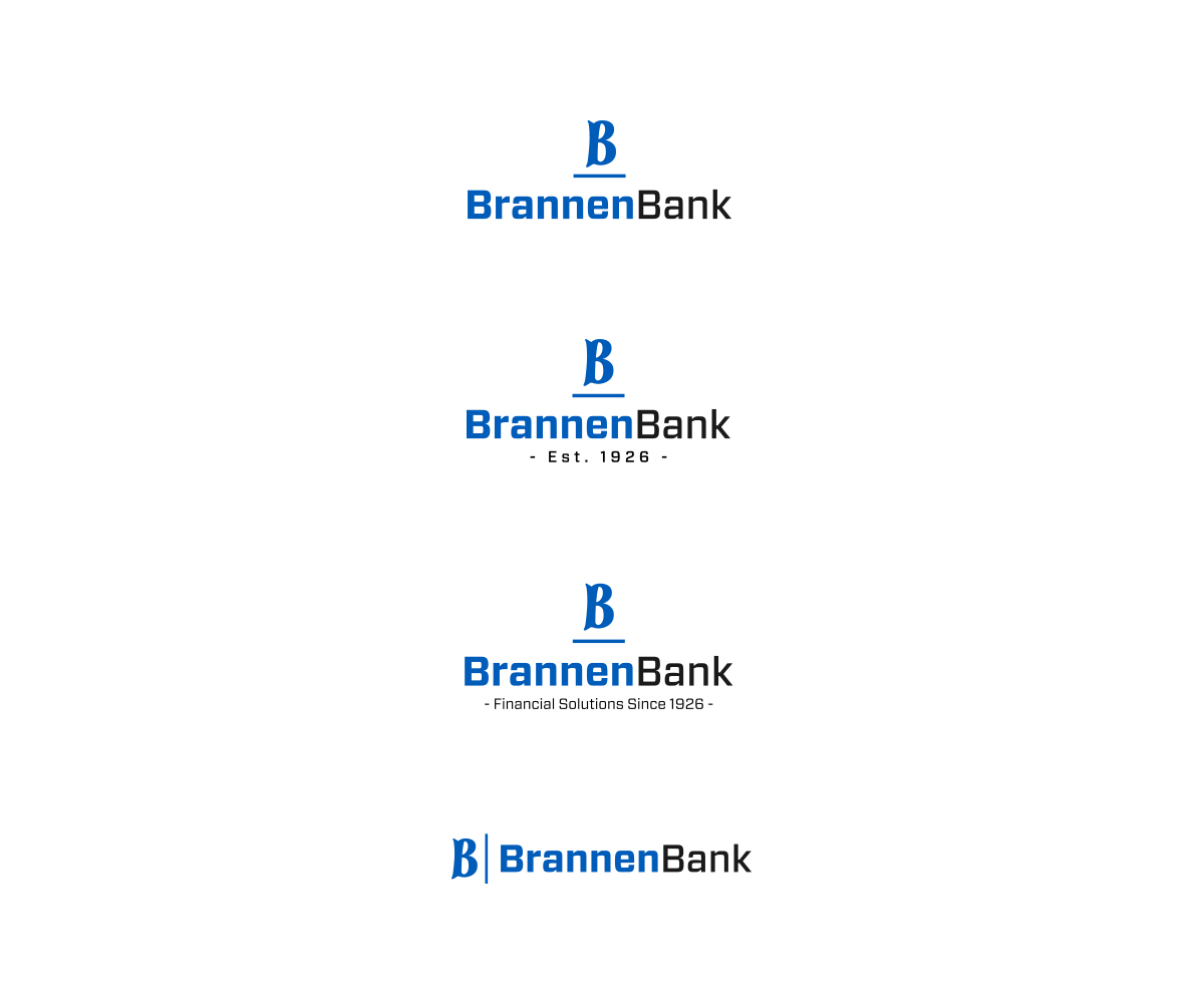
This customer received 138 logo designs from 53 designers. They chose this logo design from VisualFlava as the winning design.
Join for free Find Design Jobs- Guaranteed
-
 US$160
-
 138 designs
-
 53 designers
Logo Design Brief
We are requesting a logo design for a bank that began business 90 years ago and still owned by the same family. We are located in Inverness, FL and our major competitors are the large, national banks. We pride ourselves in our high level of service and being the "hometown bank". We do not have to use that tag line but we would like a tag line incorporated into one of the logos. We like words such as safe, secure, heritage, service, financial, lending since 1926, local decisions, unmatched (unparalleled, unequaled) service, ect. Our current logos are attached and have had very few updates over the years. We want to modernize the logo while still keeping with our conservative roots. We are also not sold on keeping the same colors. We like blues, grays, blacks. We find the state containing the "BB" very difficult to reproduce.
Updates
Project Deadline Extended
Reason: Giving more comments to designers
Added Wednesday, March 4, 2015
Industry/Entity Type
Conservative
Logo Text
BrannenBank
Logo styles of interest
Wordmark Logo
Word or name based logo (text only)
Look and feel
Each slider illustrates characteristics of the customer's brand and the style your logo design should communicate.