LinkedIn Carousel Design – Usage Based Pricing Insights
A business in United States needed a infographic design and received 3 Modern, Upmarket, Managment Consulting; Software/Tech infographic designs from 2 designers
Designs
Designers
Budget


-
 Previous page
- You're on page 1
- Page 1 of 1
-
 Next page
1 - 3 of 3 infographic designs submissions
This is what a business in United States was looking for in their infographic design
?? Task Description:
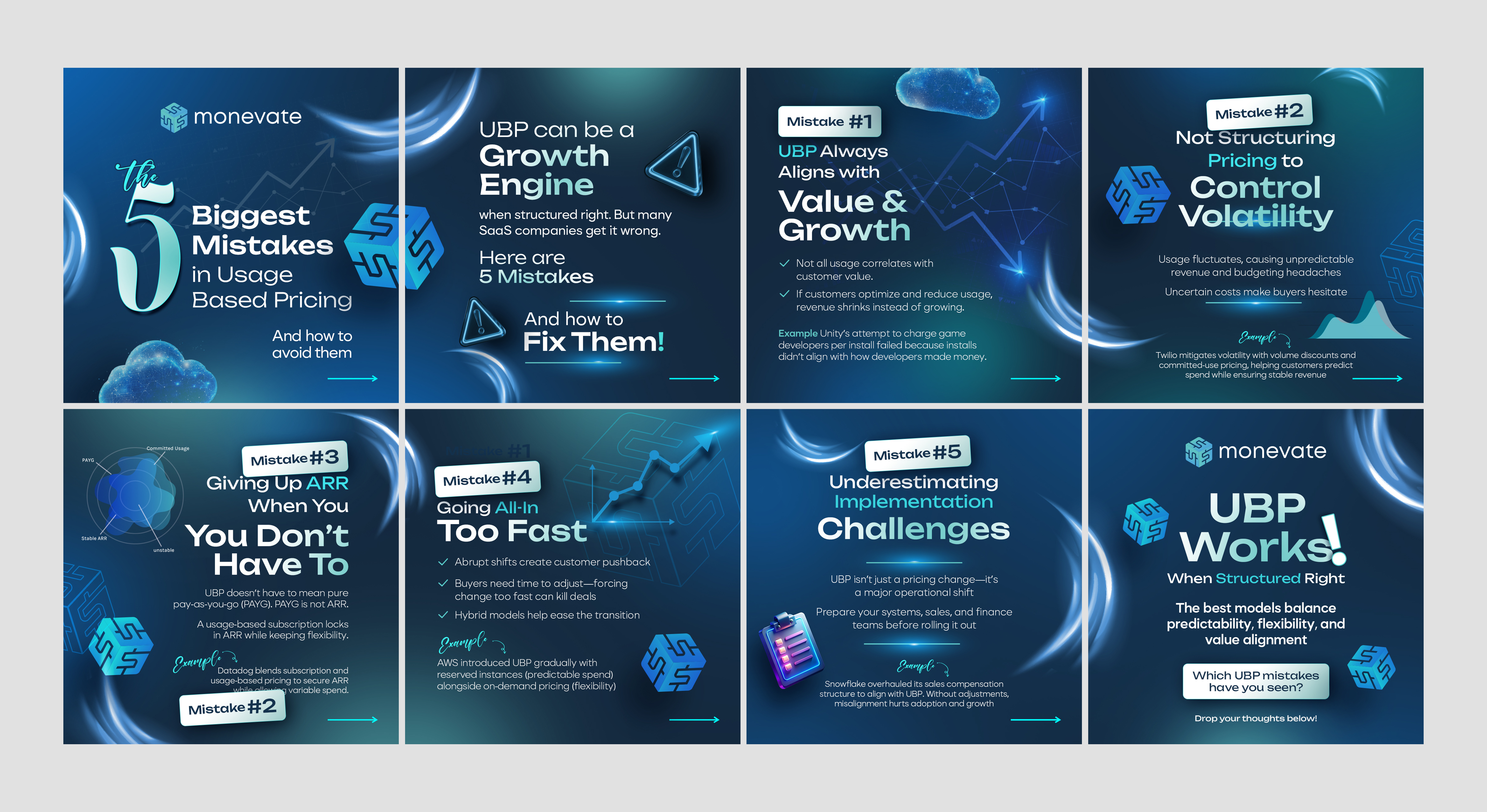
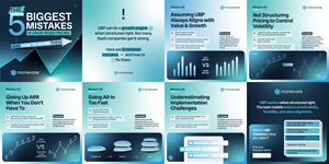
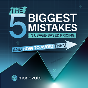
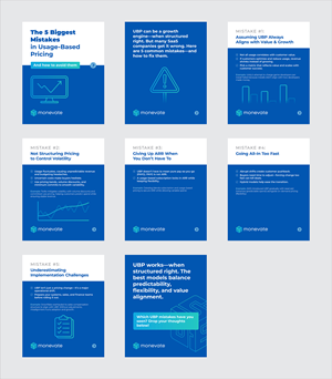
We need a clean, professional, and engaging LinkedIn carousel that visually communicates the 5 biggest mistakes SaaS companies make when implementing usage-based pricing (UBP).
The design should be scroll-friendly, visually structured, and aligned with B2B/SaaS branding. The slides must be minimalist and digestible, with strong typography and simple visual elements that reinforce the key messages.
?? Design Requirements
?? General Style & Branding:
? Incorporate the Monevate logo on each slide.
? Align look and feel with Monevate’s brand (colors, typography, design aesthetic).
? Clean, modern, and professional SaaS-style design.
? Minimalist layout with strong typography (no clutter!).
? Consistent colors, fonts, and spacing across slides.
? Icons or simple illustrations to reinforce key points.
? Brand colors aligned with SaaS/tech (e.g., blues, grays, whites, subtle accent colors for highlights).
Read more